5 Tips for Styling Your Shelves
Sinkology is proud to present Kristan Allen, our design expert and guest blogger who runs the @FarmhouseRedefined Instagram. Kristan is here to share some design ideas and inspiration around designing your home around your copper sink.
Raise your hand if you’ve ever taken a shelfie! Yep, I’m pretty sure most of us have snapped a mental image or real photo of our shelves in an attempt to uncover the perfect arrangement of items. Styling shelves can be tough – Do they look too cluttered? Do they look too empty? Should I slide this vase a few inches to the left or leave it where it is? Well-styled shelves can make a big impact in your home and I’ve compiled some of my favorite ways to really up the “wow” factor of your shelf décor.
1. Create Layers
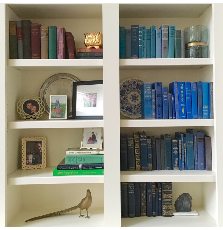
To add depth and dimension to a shelf, try creating layers of items. For example, I gathered my collection of antique silver trays and propped them up as a backdrop. Not only does this add some metallic visual interest to the background, but it also helps the smaller items in front stand out and really pop.
2. Think Outside the Box (or Wall!)
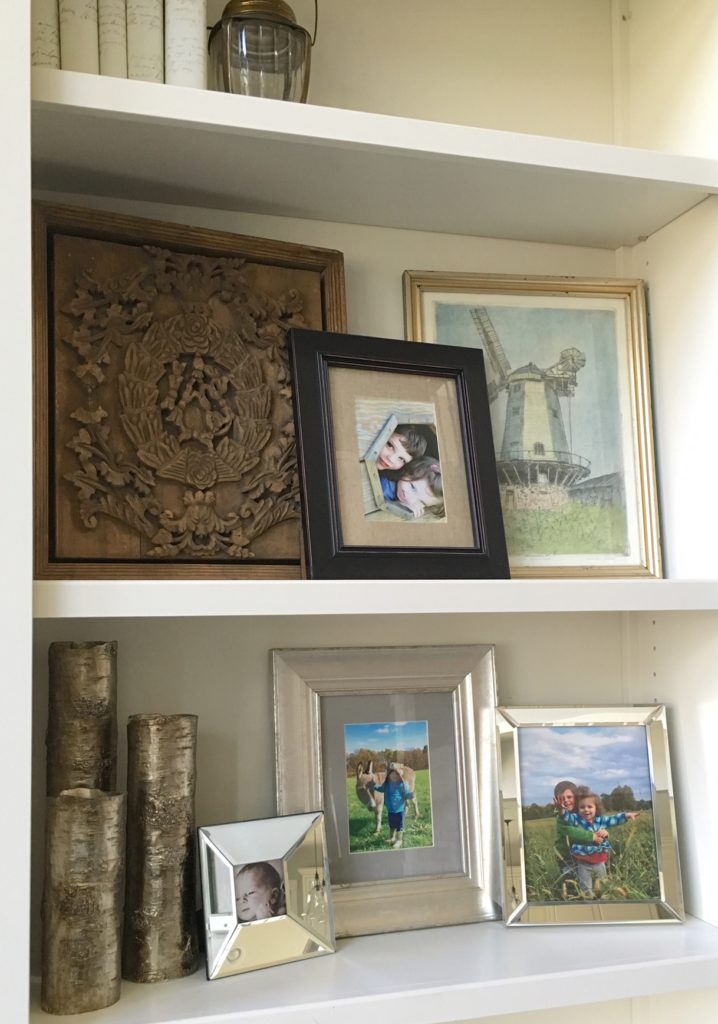
Speaking of creating layers, artwork isn’t just for walls! If you have a favorite framed print or photo, consider showcasing it on a shelf. For even more impact, group frames or prints of different sizes and overlap them a bit. It’s a great way to fill a shelf without overloading it with a bunch of tiny items.
3. Go for Contrast in Collection
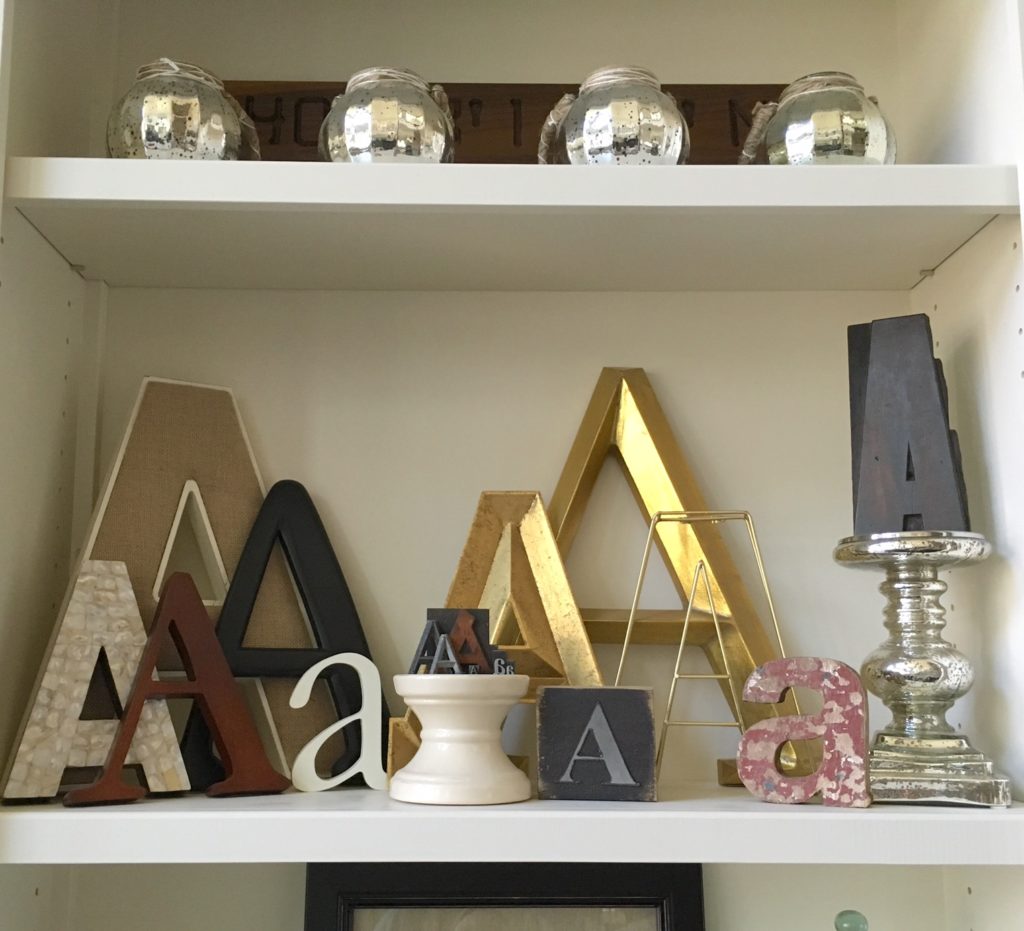
Collections look great on shelves and instantly draw people’s eyes because you’ve taken the time to curate items that mean something to you. Items in a collection inherently have something in common (ahem, hence the term “collection”). To really showcase your collection, highlight the contrast of the items. Show off the varying size of items, or their different textures or colors/finishes. If you collect things that don’t stray too far visually from one another, create contrast in their display. Use a stack of small books or a candle holder to lift some of the items up so they can be seen.
4. Don’t Be Afraid to Go Big
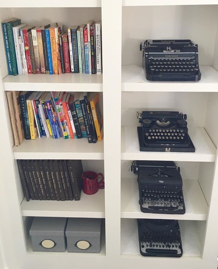
Now that I just finished praising collections and contrast, let’s go to the other end of the spectrum and say that there’s definitely beauty in simplicity. When I see a set of empty built-ins, my first reaction is usually to start brainstorming “all the things” I can put on them. But grouping larger items on a few shelves can sometimes make a bigger impact in its simplicity. I bought my first antique typewriter a few years ago and fell in love with its design. I kept buying more and, before I knew it, I had a collection of antique typewriters! With the clean, white shelves surrounding them, they look great grouped on the built-ins in my home office.
5. Delight in the Unexpected
Sometimes, all it takes is a touch of whimsy to create a fun shelf arrangement. I love all vintage books, but I have a particular fondness for old blue books. Over the years, I’ve collected a wide variety of books in varying shades of blue and decided to show them off in an ombre, light-to-dark display. The scaled, descending color almost reminds me of the ocean – getting darker the further down you go.
The colors draw people in first and then they’re hooked when they see the quirky old titles and artful covers/spines. The best part is you don’t need a giant collection to get this effect. Check out your local thrift store or library to see if they have old titles they’re looking to sell. Buy several in varying shades of your favorite color and arrange them on one shelf!
What are your go-to strategies for styling shelves? Share them on Instagram by tagging us – @FarmhouseRedefined and @Sinkology.
If you have any additional questions during your search for the perfect copper sink, our Sinkologists are here to help. Contact us or follow us on Facebook, Twitter, Houzz, Pinterest, or Instagram for more helpful tips and design ideas.


