Design Moods: A Bathroom Refresh Featuring Pantone’s Color of the Year
Sinkology is proud to present Kristan Allen, our design expert and guest blogger who runs the @FarmhouseRedefined Instagram. Kristan is here to share some design ideas and inspiration around designing your home around your copper sink.
_____________________________________________________________________________
Happy New Year, Friends! Can you believe we’re almost halfway through January already? I feel like I’m finally getting back into our non-holiday routine over here. Every January, I find myself in the mood to refresh my home…I guess it’s that itch to start fresh after the new year.
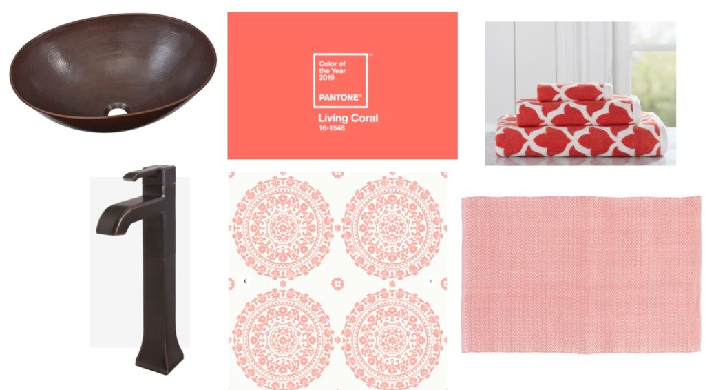
In case you missed it, Pantone announced its 2019 Color of the Year. Living Coral is, according to them, “an animating and life-affirming coral hue with a golden undertone that energizes and enlivens with a softer edge.” I don’t typically use a lot of pinky-orange colors in my decorating, but this vibrant and cheery tone is rapidly changing my mind!
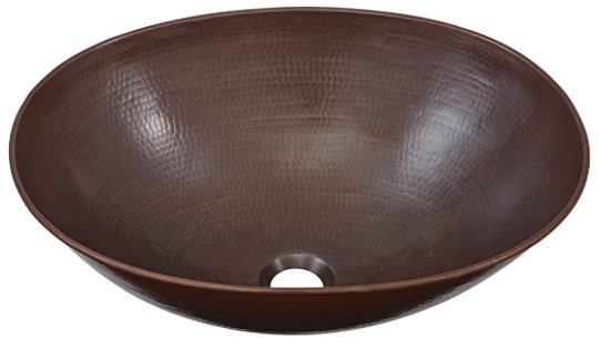
We’re sure to see a lot of this trendsetting color this year…so to celebrate, I thought it would be fun to put together a mood board for a bathroom refresh featuring this fun and bold hue. First thing’s first, copper is a natural complement to coral colorways. Their shared warmth makes them perfect companions, so I built the foundation of this mood board with Sinkology’s Maxwell Bathroom Sink. The hammered finish and soft metallic sheen add a little oomph to coral accents.

Speaking of which, I couldn’t pass up this Albany Mia Wallpaper from Wallpaper Direct. They call this color “Padstow Pink,” but it looks like the perfect coral-y color to me! The oversized medallions would be great in small or large spaces as an accent wall or all-over treatment.
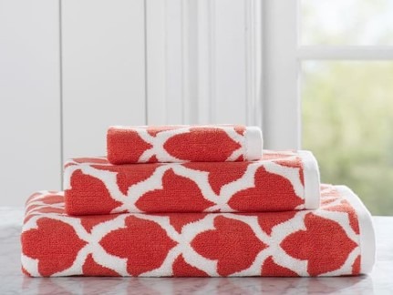
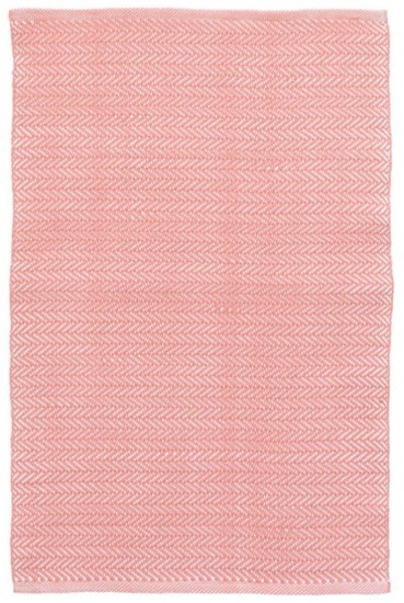
To get a little pattern-mixing going on this board, I added these Pottery Barn Marlo Jacquard Organic Bath Towels in Coral. The trellis-inspired motif gets an energizing kick of saturated color that pairs perfectly with the wallpaper. I paired the towels with an Annie Selke Herringbone Indoor/Outdoor Rug (I love using these as bath mats!) because its durable and the herringbone pattern is so delicate that it acts almost as a soft, solid color.
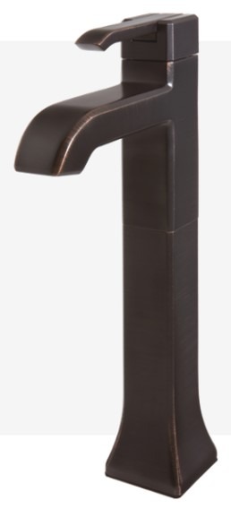
To top things off, I added a Pfister Park Avenue Faucet to the mix. This faucet is specifically designed for vessel sinks, making it the perfect height to accommodate that show-stopper Maxwell sink. The Tuscan Bronze finish feels right at home with the warm color palette. The finishes, colors and patterns all meld together to create a fresh, updated take on copper and coral. Sign me up!
What do you think of Living Coral? Do you use a lot of this color in your own decorating? Or are you like me – finding yourself inspired to use it more now? We’d love to hear what’s on your home refresh list as we kick off this new year. Tag @Sinkology on Instagram to share!
_____________________________________________________________________________
If you have any additional questions during your search for the perfect copper sink, our Sinkologists are here to help. Contact us or follow us on Facebook, Houzz, Pinterest, or Instagram for more helpful tips and design ideas.
