Budget Farmhouse Kitchen Makeover Reveal
Sinkology is proud to present Ashley Carpenter, a homebody, decor obsessed, DIYer that loves fitness, happy people and wants nothing more than to be on the lake soaking up the sun with good people and good music. Ashley runs the blog Joyfully Growing and is here to share a few tips, tricks and DIY projects that perfectly fit her farmhouse style.
Eeeek! I am so incredibly excited to share our budget kitchen makeover reveal with you today!
I’ve never been more excited in all my life to cook and do the dishes.
Ever since moving into this house, I’ve been looking forward to giving our kitchen a little face-lift. And while I’d love to give it a complete overhaul and pick out the fanciest of finishes to make my Pinterest dream kitchen come to life, that just isn’t in the budget right now. So instead, we selectively chose a few updates that we knew would give us the most bang for our buck! And I couldn’t be happier with the end result. Note: the complete budget breakdown is listed at the bottom of the post!
But what’s a good reveal without a quick look back at what it looked like before?
Here’s what the kitchen looked like on the day we moved in:
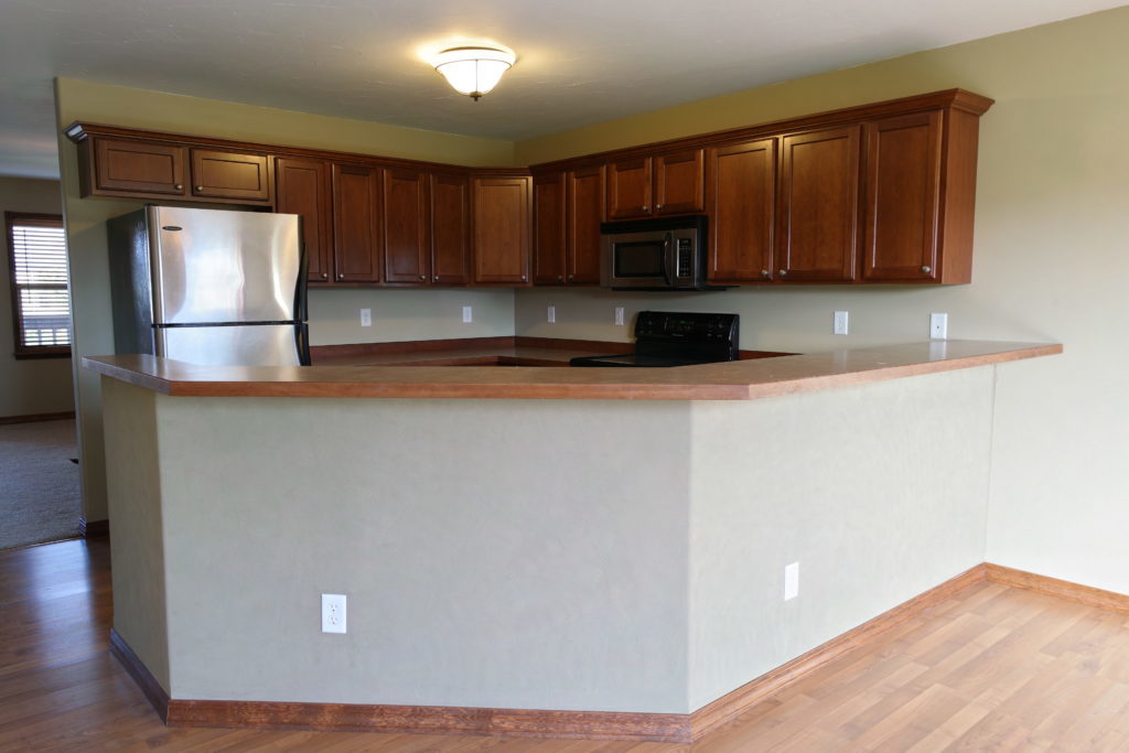
It had a weird greenish-greige paint color, an awkwardly sized refrigerator, and a whoooole lotta wood cabinets & wood trim. Add in the fact that there aren’t any windows, and it’s basically the perfect combination to create a dark and gloomy space. Ewww…
But, it’s come a long way since then and today I’m spilling all the details that went into this budget kitchen makeover. Ready to see how it all turned out?
I present to you….*drumroll*…. our kitchen makeover reveal!
OUR WOOD AND WHITE KITCHEN REVEAL
A huge thanks to Sinkology for providing products for this space! This post contains affiliate links, please see my disclosure here for more information.
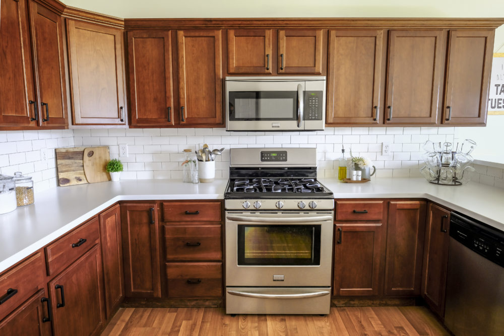
Come on in and let me give you a little tour and share about each of the changes we added to this space.
When I shared our plans for this kitchen makeover, I mentioned that we were going with LG Hi-Macs Solid Surface countertops in Arctic White. We chose solid surface over the many natural stone options in order to keep costs down. But not only are solid surface countertops an affordable option, they are also low maintenance and extremely durable.
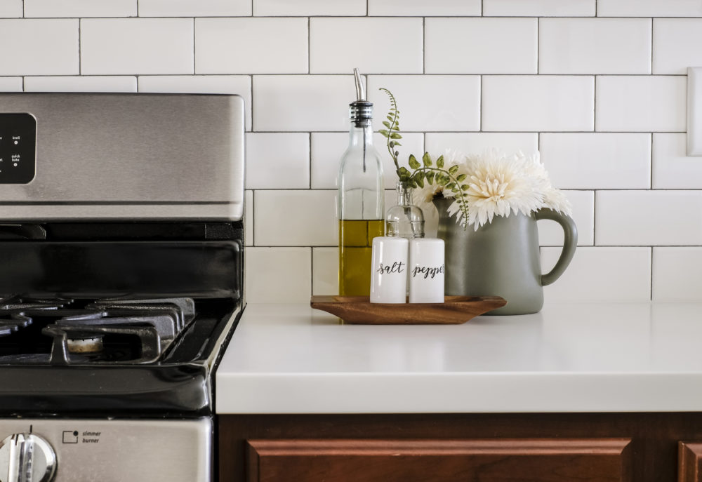
These countertops will stand up to everyday scratches and wear with similar durability to that of natural stone, but with a price tag that won’t break the budget. This was really important to us when deciding on a countertop material.
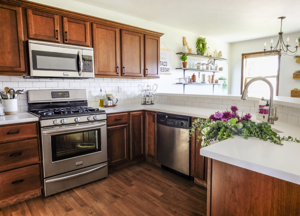
What really sold me on these countertops, though, was the fact that they are extremely low maintenance. Not only do they have a high resistance to stains, chemicals and heat, but I love that this material is non-porous. Read: easy to keep clean! Because, I’m not gonna lie… I am terrible when it comes to re-applying sealants and waxes!
No need for any of that with these beauties!

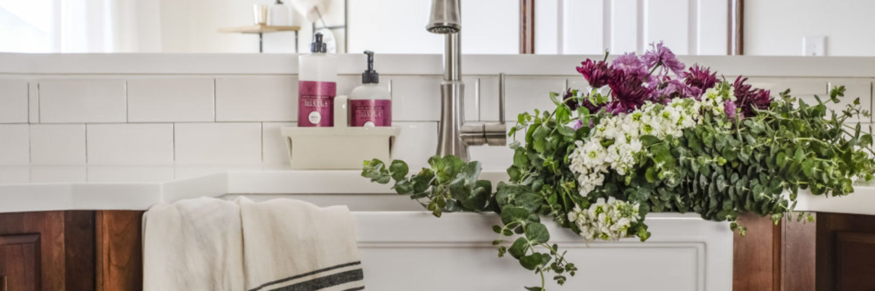
Speaking of beauty, let me introduce you to my favorite part about our kitchen makeover: our new farmhouse sink!
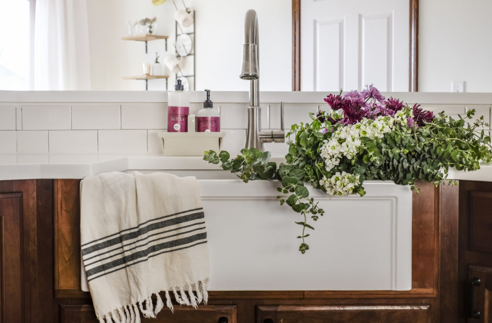
Pretty much since the day I discovered Pinterest, I’ve been dreaming of one day owning a farmhouse sink. And let me just tell you, this sink has lived up to those dreams and more!
This all-in-one sink kit was generously provided by Sinkology. The all-in-one kit includes a fireclay apron front sink, a Pfister pull down faucet, and a couple of sink accessories like a metal grid for the bottom of the sink and a matching drain stopper.
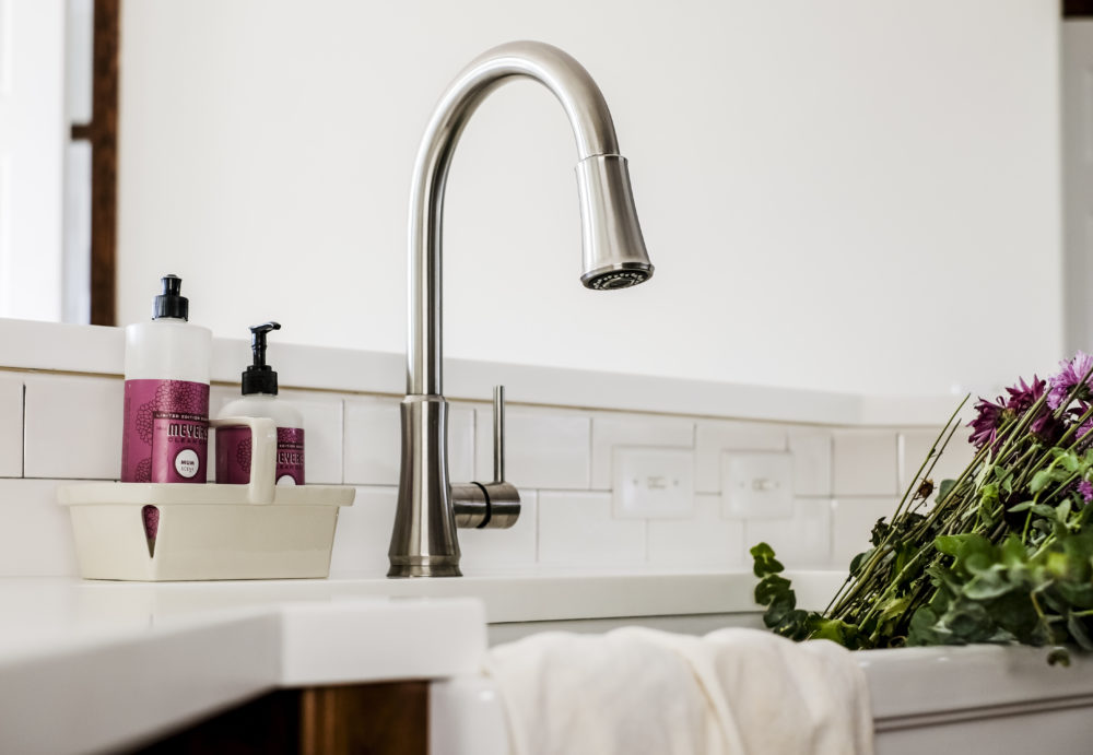
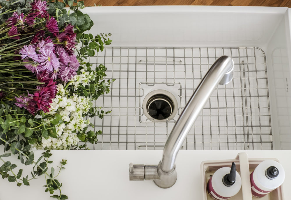
Not only is it gorgeous, but I absolutely love the functionality it provides. The giant, single basin sink really is so easy to use and dare I say that it makes washing dishes actually enjoyable?!
I love that the fireclay sinks by Sinkology are tough, durable and easy to maintain. All it takes is a little soap and hot water to keep this thing looking spotless!
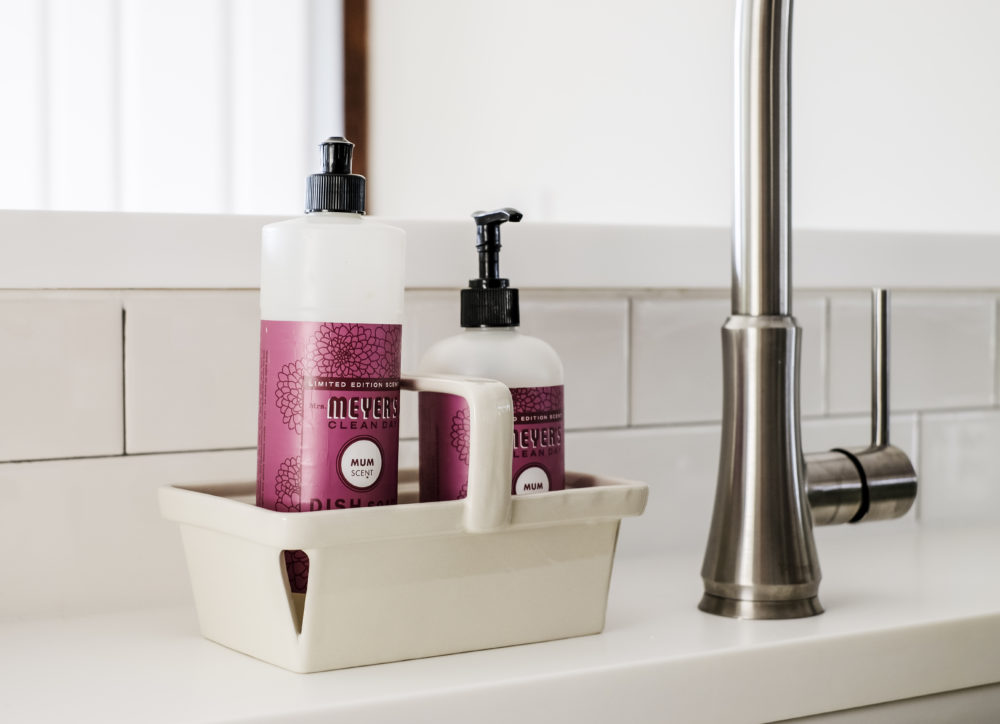
Pretty flowers help too. 🙂
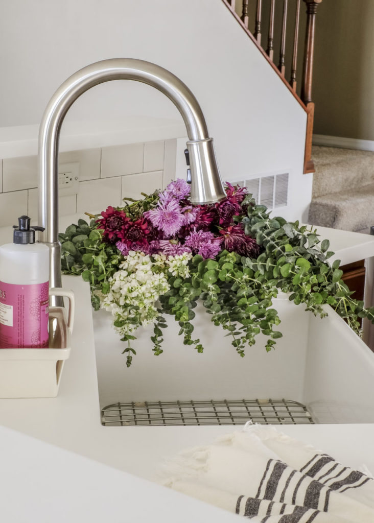
The sleek pull down Pfister faucet creates the perfect blend of modern and traditional for the space. It’s easy to use and the pull down faucet makes rinsing out the sink so easy.
We are loving it!
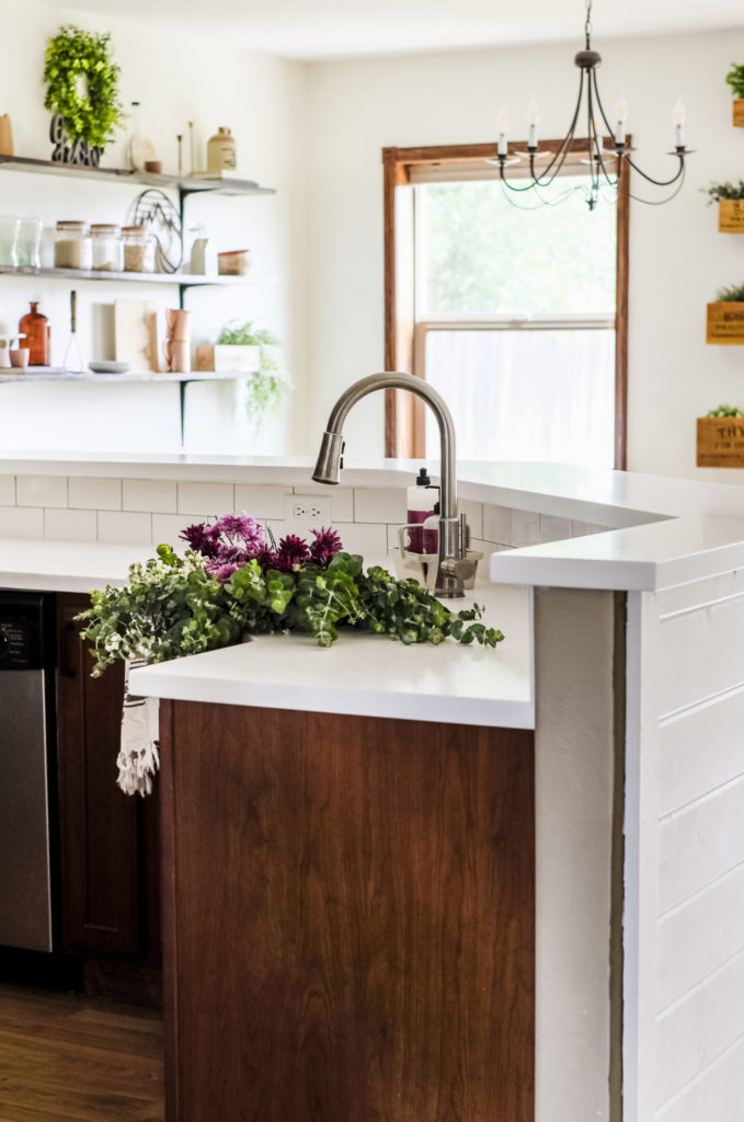
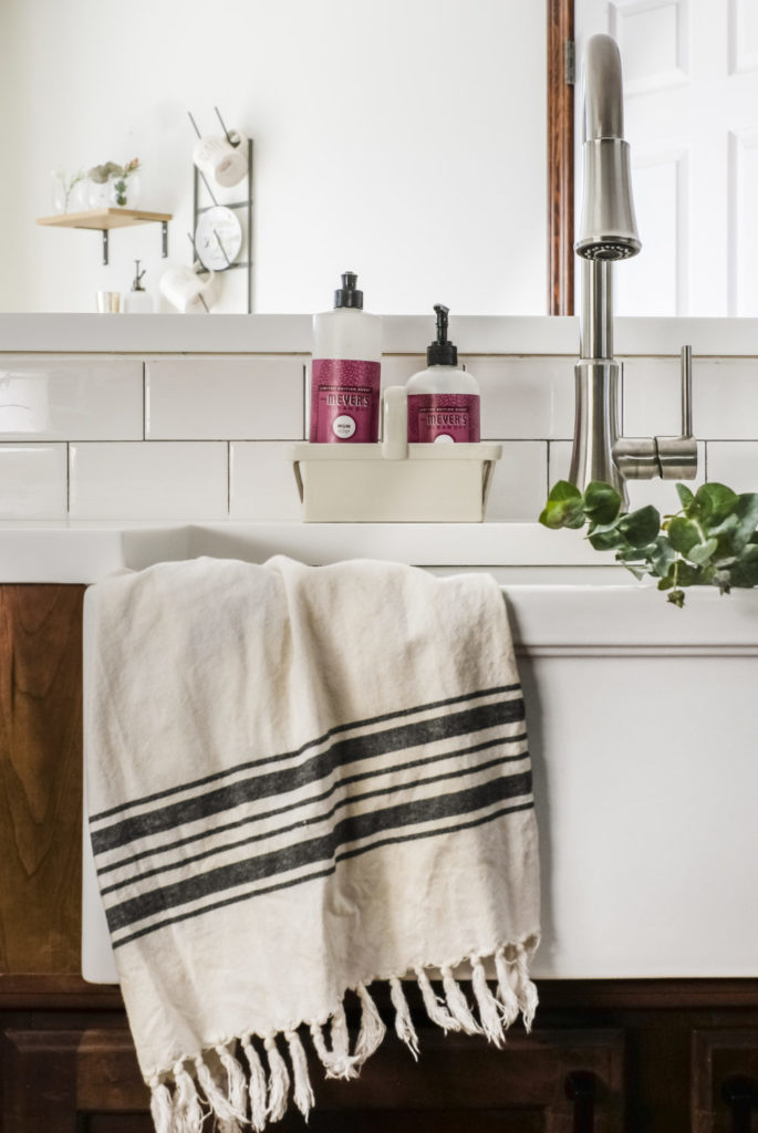
You may have caught a glimpse of our new backsplash behind the sink – subway tile! I decided to go with white subway tile to pull in more light finishes to help brighten up the kitchen. And since the countertops were a solid white, we went with a medium grey grout to give it some contrast.
Subway tile is such a classic style that I feel will look good in this space for years to come. Mike and I did the whole installation ourselves (ok, mostly Mike – but I provided moral support ).
It was no easy task, but in the end I think it turned out wonderfully!
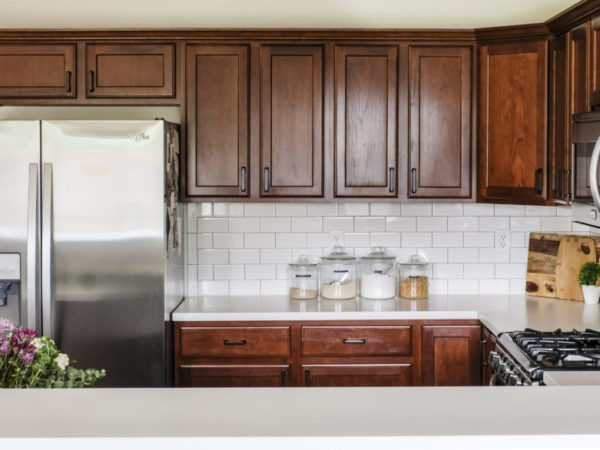
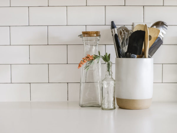
We upgraded our ONE overhead light fixture to a flush mount LED option from Amazon. I would have loved to add some pretty pendant lights over the bar area, however, that project just wasn’t in the cards for this budget kitchen makeover.
Instead we opted for above/below cabinet lighting. And from a functionality standpoint, I am SO glad we did. To see how we DIY’ed our cabinet lighting in under 30 minutes, checkout the tutorial in this post!
We added shiplap under the breakfast bar shortly after moving in. Originally it had been covered with a textured paint that would be really hard to cover up without sanding it all down first. So while we were adding a wood plank accent wall to our master bedroom, we went ahead and covered up the textured paint with shiplap!
Since there was already so much wood in the kitchen with all of our cabinetry, I decided to paint the shiplap white. It ended up matching our new countertops perfectly!
The industrial style barstools are from World Market. They can be adjusted to counter height or bar height, which will come in handy if we ever want to move them to a different area in the future.
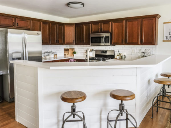
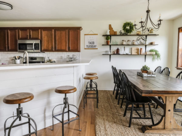
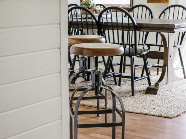
Speaking of white paint, I also painted all of the walls in this space using the same shade of white I’ve used throughout the rest of our home (Benjamin Moore White Dove). Checkout my top 5 favorite white paints in this post!
Since we decided to keep the cabinets in their original wood color, painting all of the walls white really helped brighten up the entire space.
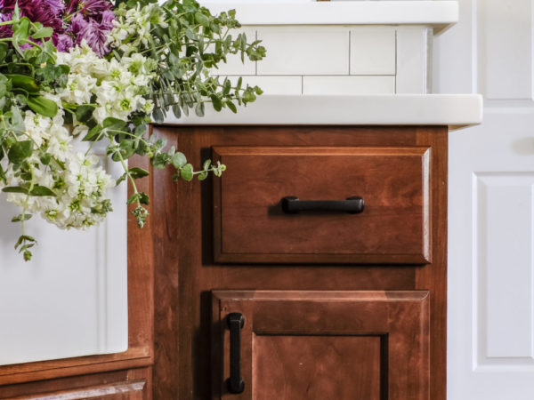
I originally planned on keeping the existing cabinet pulls, but I changed my mind at the last minute. We’re talkin’ the day I planned on photographing the space for this blog post – last minute!
My poor husband, ha! (I can’t be the only one who does this right? )
But after all of the old pulls were switched out for the new ones, I knew I made the right choice.
These cabinet pulls are the perfect blend of modern and rustic, which is totally my style! And thanks to Amazon Prime, my last minute decision only set the grand reveal back by 2 days.
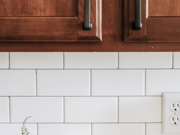
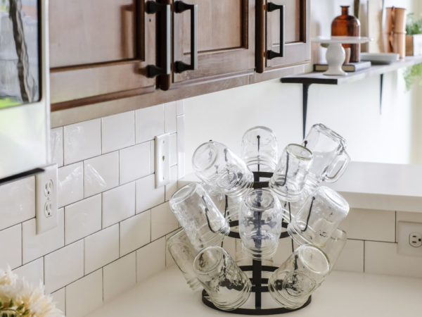
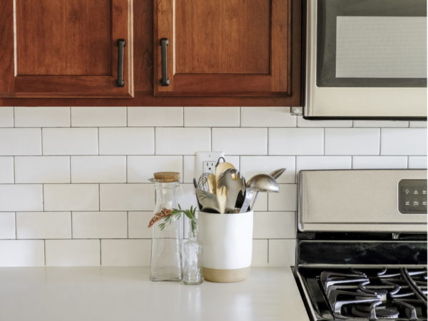
Along the way we have upgraded each of the 3 main appliances: refrigerator, oven/range, and microwave. We were able to snag the refrigerator off of Craigslist for only $400 (score!) and the microwave and oven/range are from Home Depot.
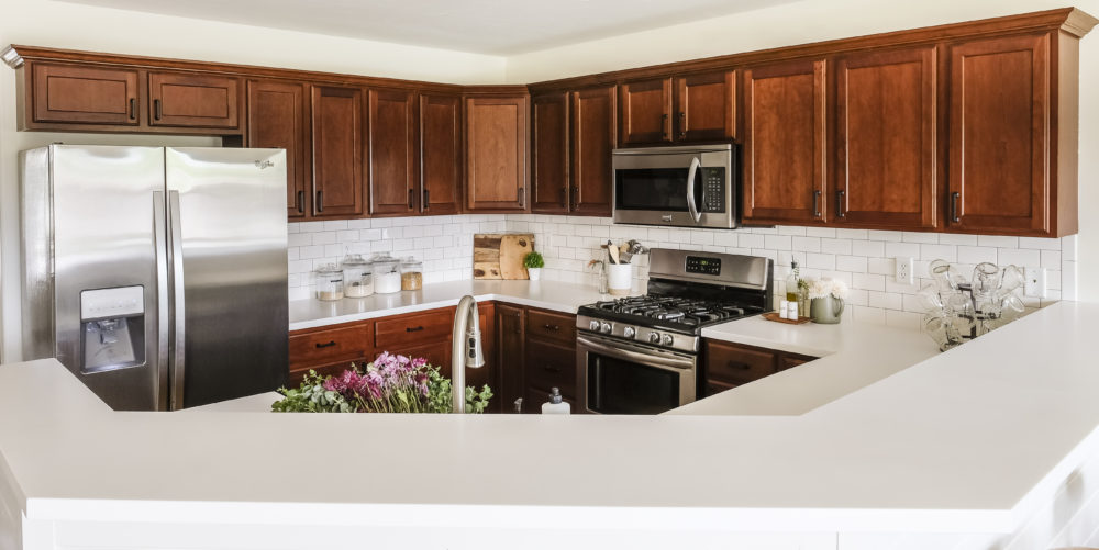
Overall I am beyond happy with how our budget kitchen makeover turned out! It just goes to show that it IS possible to upgrade a space without having to upgrade your budget.
All of the decor was sourced from things I already had around the house and in the pantry. This really helped keep our overall costs down.
Speaking of budget, here is how our grand tally ended up…
Budget Breakdown:
- Countertops– $3,400
- Sink & Faucet: Sinkology– $699
- Backsplash: Subway Tile– $162
- Shiplap Project (tutorial here) – $137
- Wall Paint: Benjamin Moore White Dove – $36.98
- Ceiling Light Fixture– $96.99
- Cabinet Lighting (tutorial here) – $66
- Barstools– $312 for 4 (on sale 40% off)
- Cabinet Hardware– $143
- Refrigerator– $400 (craigslist)
- Microwave– $278
- Oven/Range– $647
Total: $6,377.97
All in all, I’m really proud of the transformation we were able to pull off while keeping our budget well below $10K. That isn’t easy to do in a kitchen!
You can see the difference all of the changes make in the before/after!
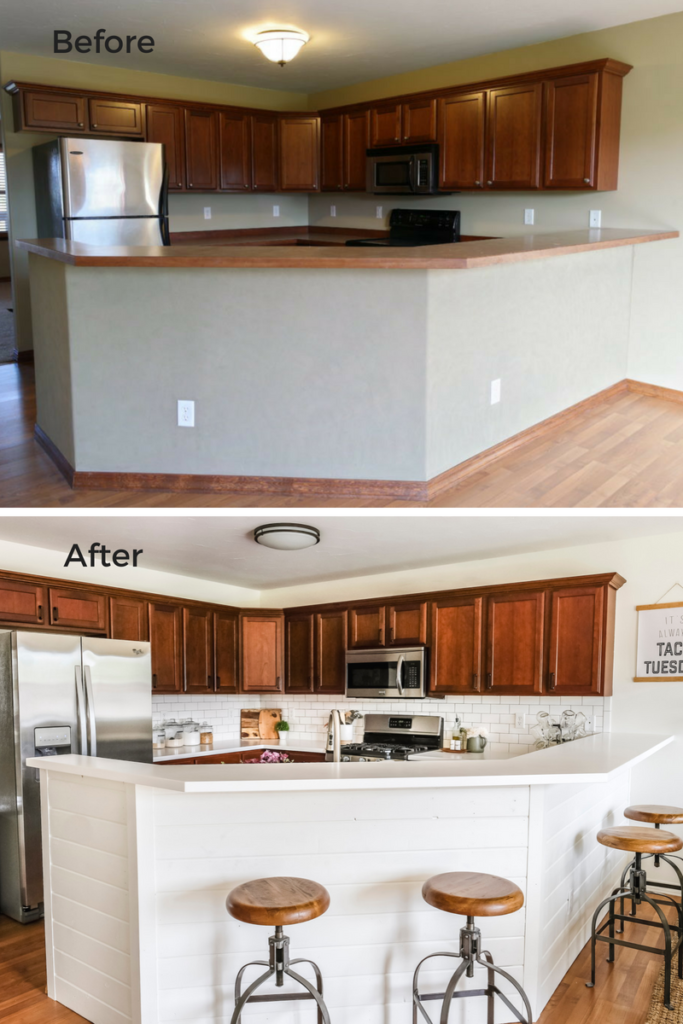
We love spending time in here now and it definitely feels like it is more “us“.
If you’re curious about where any of the decor is from, I tried to link as much as I could in the source list below:
Decor Source List:
- Glass Storage Jars (1 gallon| 1/2 gallon)
- Large Cutting Board
- Small Cutting Board
- Artificial Plant in White Pot (similar)
- Glass Carafe (similar)
- Small Vintage-looking Glass Bottle
- Utensil Holder
- Oil Dispenser
- Salt & Pepper Shakers
- Wood Tray
- Green Pitcher (mine is from the Hearth and Hand line at Target, but I couldn’t find it online. Here is a similar one from Amazon)
- Mason Jar Drying Rack
- Dish Towel
- Meyers Dish Soap(scent is “Mum”)
- Meyers Hand Soap(scent is “Mum”)
- Ceramic Berry Basket(holding soaps)
- “Taco Tuesday” Hanging Wall Print(use Joyfully20 for 20% off your order!)
- Jute Rug(on sale now!)
- Dining Table
- Dining Chairs
- Metal Tray
- State Cutting Board
- Boxwood Wreath
- Small Topiary Tree
- Coca Cola Glasses
- Wooden Bowls
- Cake Stand
- Copper Mugs
If you missed any of our previous posts in our kitchen series, you can catch up here:
Planning a Budget Kitchen Makeover
How to Add Cabinet Lighting in 30 Minutes
10 surprisingly awesome Amazon finds for the kitchen
And if you were oogling those dining room shelves of mine (self diagnosed #shelfie addict right here ), you’ll LOVE this post where I share my 5 proven tips for perfectly styled shelves!
Thanks for following along and cheering us on as we’ve tackled this makeover, friends! I hope you enjoyed the tour!
If you have any additional questions during your search for the perfect copper, fireclay farmhouse sink or granite sink, our Sinkologists are here to help. Contact us or follow us on Facebook, Houzz, Pinterest, or Instagram for more helpful tips and design ideas.